

Event Branding
for Take a Pain Check foundation
Create expanded branding and materials for the non-profit Take a Pain Check Foundation’s first in-person conference event.

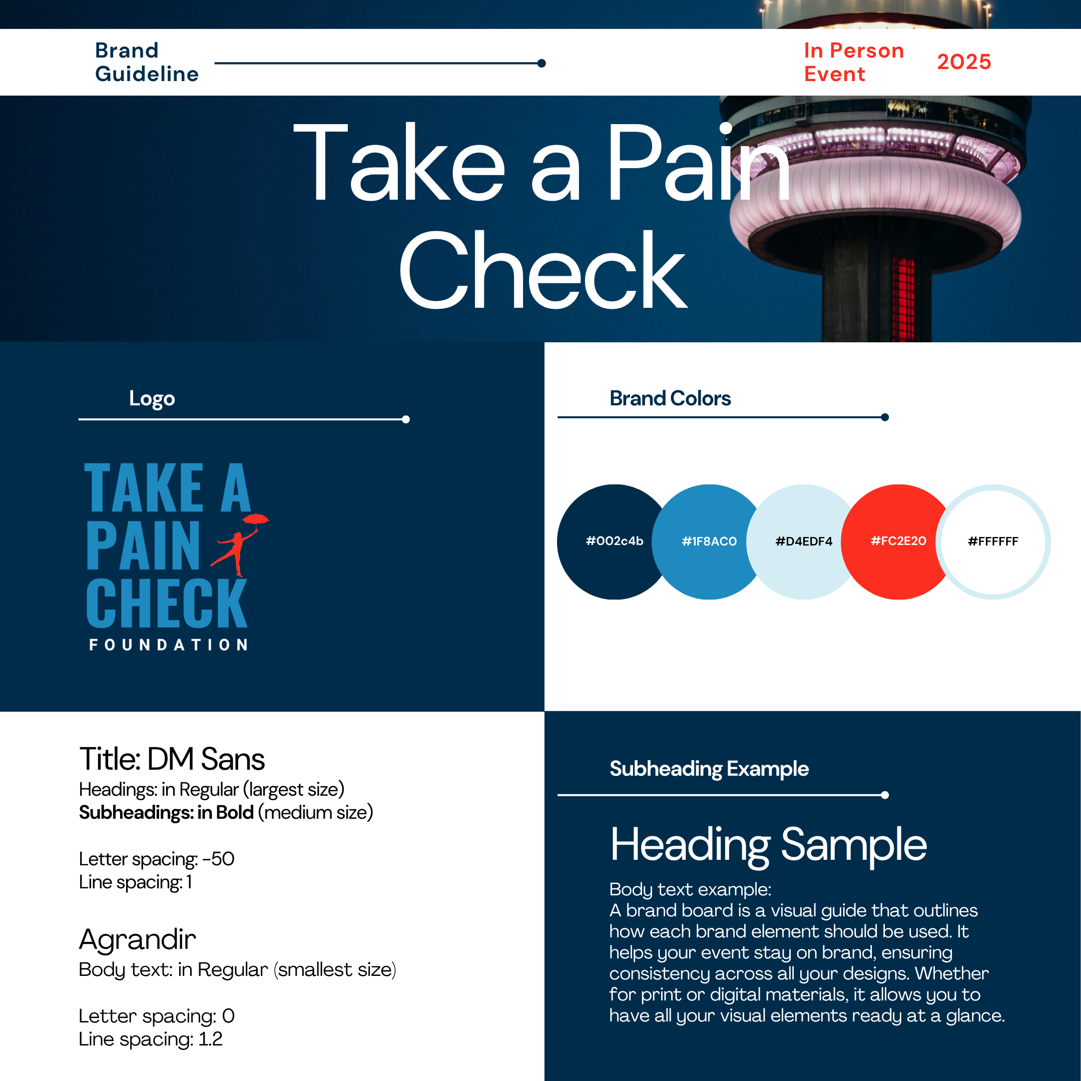
TAPC Foundation utilizes 3 colours, along with black and white, in the vast majority of its branding. Understanding how these colours, their logo, and other elements are utilized in their digital materials is important to understand at the beginning of the project. Having previously worked with TAPC Foundation for several years, familiarity with the organization’s existing brand guidelines and visual language allowed for a more efficient analysis.
TAPC Branding

Brief
Develop unique yet familiar branding for the Take a Pain Check Foundation’s (TAPC) first in-person conference, with a cohesive visual identity applied across digital and print marketing, web content, event signage, promotional materials, and other conference communications. The overall design should reflect the organization’s existing visual language while introducing new themes that align with the conference's purpose and significance.
Mood Board & Inspiration
It was important for the organization to establish a distinct look and feel for its first conference while remaining consistent with its existing brand identity. The team also considered imagery of the CN Tower in Toronto, as the city is both the organization’s place of origin and the location of the event.
When exploring visual inspiration, imagery that conveyed themes of connection, Toronto, and breaking through barriers was particularly relevant to the conference’s purpose and message.










Branding
After a few mockups were created and reviewed with the management team, the decision was made to retain the original branding colours while adding a deep blue and incorporating different elements that aren’t commonly found in the rest of the foundation’s branding. This distinct look can be quickly associated with the organization while clearly representing the unique goals and mission of the conference.
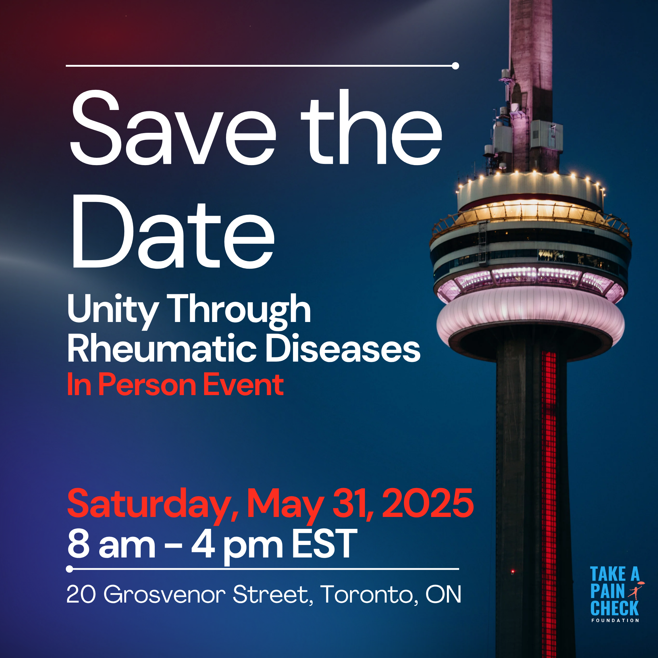
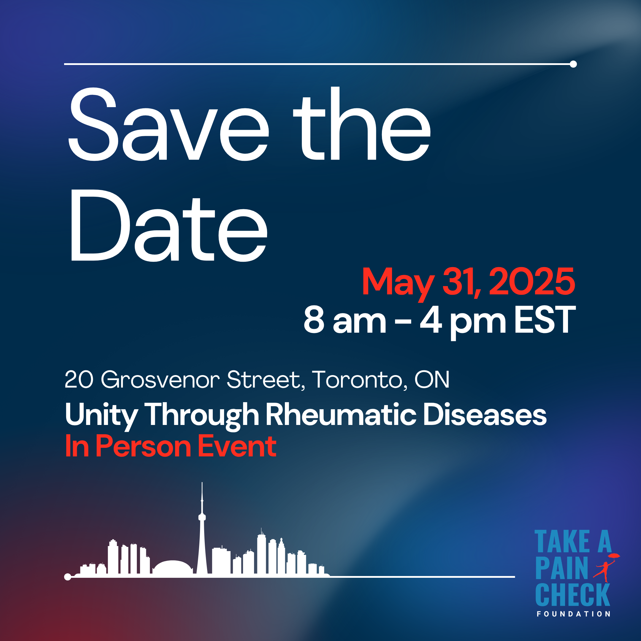
As this branding was intended to be used by different teams within the organization, a branding template was created, along with some initial Instagram posts as examples. It was important to create the branding template in an accessible and user-friendly manner, as most individuals working with it are volunteers without formal design or marketing training. This template was created using Canva as most volunteers are very familiar with this tool. Shortly after the branding was disseminated, other templates were created and shared, including a presentation/slideshow, agendas, banners, name tags, and more.
Visual Assets
After a few mockups were created and reviewed with the management team, the decision was made to retain the original branding colours while adding a deep blue and incorporating different elements that aren’t commonly found in the rest of the foundation’s branding. This distinct look can be quickly associated with the organization while clearly representing the unique goals and mission of the conference.
Slideshow template